Businesses today are flooded with more data than ever before, but raw numbers alone rarely inspire action. People need to see information to understand and act on it. That’s where data visualization comes in. Turning complex datasets into charts, graphs, and infographics allows you to make patterns and insights instantly clear to your audience.
Whether you’re a marketer trying to showcase campaign results, a business leader presenting KPIs, or an analyst reporting trends, mastering data visualization techniques will help you tell a compelling story with your data. In this guide, we’ll cover data visualization, why it’s crucial in marketing, the top data visualization tools, and the best practices you can use to ensure your visuals are clear, accurate, and persuasive.

What is Data Visualization?
Data visualization is the visual representation of information using charts, graphs, maps, and other design elements. The goal is to communicate data clearly and efficiently, enabling viewers to understand trends, outliers, and patterns quickly.
While tables and spreadsheets have their place, visualization adds a layer of accessibility that numbers alone can’t provide. For example:
- A bar chart can show product sales by month at a glance.
- A heat map can reveal which regions are generating the most leads.
- A pie chart can break down budget allocation in seconds.

Source: Boost Labs
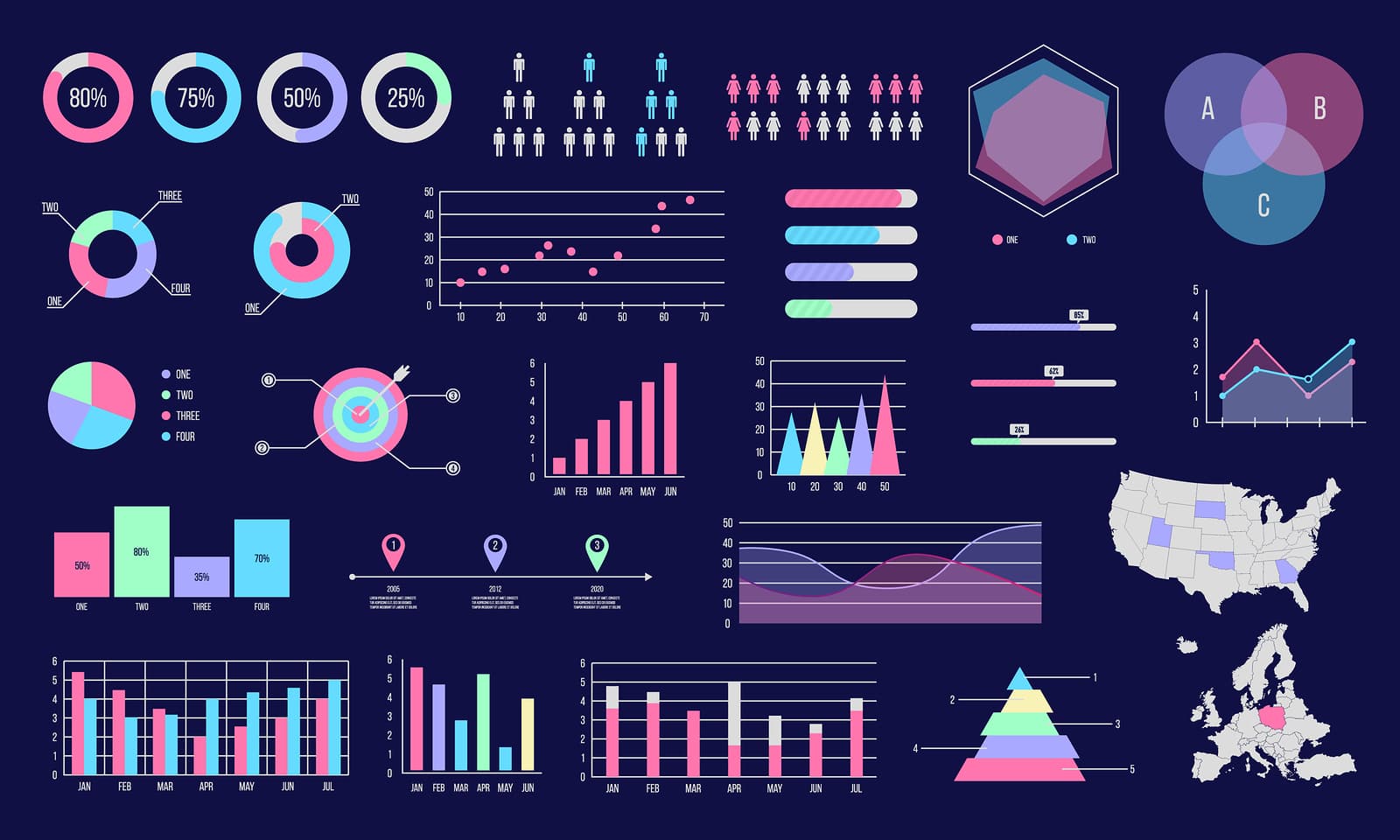
As shown by the image above, there are many types of data visualization, including:
- Bar and Column Charts: Great for comparing quantities across categories.
- Line Charts: Ideal for showing trends over time.
- Pie and Donut Charts: Useful for displaying proportions.
- Heat Maps: Show intensity or density using color gradients.
- Scatter Plots: Reveal correlations between two variables.
- Maps: Display geographic data effectively.
Choosing the right visualization type depends on your audience, the data you’re presenting, and the story you want to tell.
Why is Data Visualization Important in Marketing?
You’re constantly measuring marketing performance, from social media engagement and website traffic to email open rates and customer acquisition costs. Presenting this information in a spreadsheet may be precise, but it’s not always impactful.
Data visualization makes your marketing analytics more engaging and easier to interpret, helping you:
- Communicate ROI Clearly: Clients, executives, and stakeholders can instantly see the results of campaigns.
- Spot Trends and Patterns: Quickly identify which channels are performing well and which need adjustments.
- Increase Stakeholder Buy-In: Visually compelling reports make securing budget approvals and project support easier.
- Make Data-Driven Storytelling More Persuasive: Turning raw data into visuals helps you build a narrative around your results.
For example, suppose your Facebook ads outperform your Google Ads in cost per conversion. In that case, a side-by-side bar chart will make that difference obvious without a single sentence of explanation.
How Can Data Visualization Help Improve Decision-Making?
Regarding strategic business and marketing decisions, speed and clarity matter. Data visualization supports better decision-making in several ways:
- Simplifies Complex Information: Large datasets become digestible visuals.
- Highlights Critical Insights: Helps decision-makers focus on key metrics.
- Encourages Collaboration: Teams can understand data without deep analytics training.
- Reduces the Risk of Misinterpretation: A well-designed visual clarifies the intended takeaway.
Consider a sales team planning next quarter’s strategy. A heat map of regional sales performance can show where to invest more resources without forcing anyone to dig through hundreds of spreadsheet rows.
What Are the Best Practices for Creating Clear Data Visualization?
Even the best data visualization tools can’t save a poorly planned chart. To ensure your visuals are clear and compelling, follow these best practices:
1. Know Your Audience
Tailor the level of detail and complexity to the people who will view your visualization. Executives may prefer high-level dashboards, while analysts may want detailed charts. Consider their needs and what will speak to them so you can display your data accordingly.
2. Choose the Right Chart Type
Match your data to the most appropriate visual format. For instance, use a line chart for trends over time, not a pie chart. Selecting the type of chart that makes the most sense will make it easier for your audience to review and understand the presented data.
3. Keep it Simple
Avoid unnecessary design elements that distract from your message. Minimalist visuals are often more powerful than busy ones. The last thing you want is to pull their attention in multiple directions. Focus on what matters the most so they aren’t getting distracted.
4. Use Color Strategically
Color can guide the eye, highlight key points, and group related data. However, too many colors can cause confusion, so don’t overdo it. You can also add a color key to make it easier to understand.
5. Label Clearly
Ensure all axes, data points, and legends are labeled so viewers understand precisely what they’re looking at. It’s best to address any potential questions beforehand so no one is confused.
6. Maintain Accuracy
Never distort scales, crop axes, or manipulate visuals in ways that mislead the audience. Presenting accurate information is your top priority when it comes to data visualization. Once you’ve put your data together in a neat presentation, always double-check that everything is correct.
7. Tell a Story
Context matters. Always frame your visualization, briefly explaining what the viewer should take away. You want to make the information as simple as possible.
What Are the Most Effective Data Visualization Tools?
There’s no shortage of data visualization tools, from simple drag-and-drop interfaces to advanced analytics platforms. The best choice depends on your goals, budget, and technical expertise.
Here are some top options:
- Tableau: A leading platform for interactive data dashboards. Ideal for businesses needing in-depth analytics and visual storytelling.
- Power BI: Microsoft’s powerful visualization tool integrates seamlessly with other Microsoft products. Great for organizations already using the Microsoft ecosystem.
- Canva: While not a dedicated analytics tool, Canva makes it easy to design visually appealing charts and infographics for presentations and social media.
- Excel: A classic option, but still highly effective for creating quick charts and graphs when working with smaller datasets.
When selecting a tool, consider factors like ease of use, integration with your existing data sources, customization options, and whether you need interactive dashboards or static visuals.
What Are the Top Data Visualization Techniques?
Mastering data visualization techniques will make your work stand out and improve comprehension. Here are a few proven approaches:
1. Highlight Key Insights
Use contrasting colors, bold fonts, or callout boxes to highlight your main points. This will allow you to highlight the most critical information, ensuring it doesn’t get lost in the data.
2. Use Interactive Dashboards
Allow users to explore data on their own. Filter by date, product, or location for a personalized view. Doing so ensures you can collect the exact data you’re looking for.
3. Combine Multiple Visuals
Pair complementary charts (like a line chart and a bar chart) to give multiple perspectives on the same dataset. If going this route, be sure to choose the charts that are most appropriate for the given data.
4. Incorporate Real-Time Data
Real-time dashboards help teams respond quickly to changing metrics. It’s smart to have these pulled up at the same time you’re presenting the charts and graphs you’ve already created.
5. Leverage Storytelling Principles
Arrange visuals in a logical order that builds toward a conclusion, guiding the viewer from context to insight to action. This ensures everyone walks away with a complete understanding of the data.
Use Data Visualization to Enhance Your Next Campaigns
Data visualization isn’t just a design trend. It’s an essential skill for marketers, analysts, and business leaders who want to make data-driven decisions. By understanding the different types of data visualization, using the right tools, and applying proven techniques, you can transform raw information into compelling visuals that inspire action.
You can then use that information to shape your strategy moving forward, as you capture leads, build personalized landing pages, and more. Hushly can help you achieve those things.
Book a demo to experience Hushly today.

