With years of marketing experience, you understand the power of “show, don’t tell.” Your website tells buyers what you offer, but your product demos are a chance to back your words with a powerful demonstration. SaaS companies benefit the most from demos since words only give a glimpse of SaaS products. However, a quality demo allows buyers to dive into the full capabilities of a SaaS tool or platform.
How do you encourage more customers to sign up for product demos?
Explore some of the best demo request pages and learn what each example does well to reach its unique audiences.

What Is a Demo Request Page, and What Should It Include?
A demo request page is a separate landing page or pop-up that encourages customers to sign up for a product or service. A product demo shows customers a product’s capabilities. It’s also a chance to collect lead information to nurture leads into customers.
What should a demo request page include?
- A simple, straightforward design with only one call to action (CTA): signing up for the demo
- A quick explanation of what the demo includes
- A large, clearly identifiable button for requesting a demo
- A request a demo form to collect the customer’s email and other details to qualify and nurture the lead (The ideal form length is between three and five fields)
6 Best Demo Request Pages That Drive Results
Let’s look at demo landing page examples incorporating those tips and some unique takes on the demo page to learn how to increase demo requests.
1. Hushly
The Hushly demo request page minimizes distractions so customers fully focus on the demo. There’s not much text on the page – just two titles and a sentence describing what’s in the demo.
Why is this demo page design effective?
Customers who arrive on this page are already interested in the demo. The Hushly blog and other web pages did their job of convincing the reader to sign up. Now, the page minimizes any distractions, like long blocks of text, so the reader signs up for the demo before they change their mind.
Hushly also uses a gift card incentive to encourage customers to sign up for the demo. Incentives are an effective strategy to give visitors a little extra encouragement if they’re still on the fence.
Hushly’s demo request form removes all the extra fields and only asks for a business email and country. These details are enough to qualify leads while not being overwhelming for visitors. Remember, visitors are most likely to fill in forms if it doesn’t take too much time or effort.
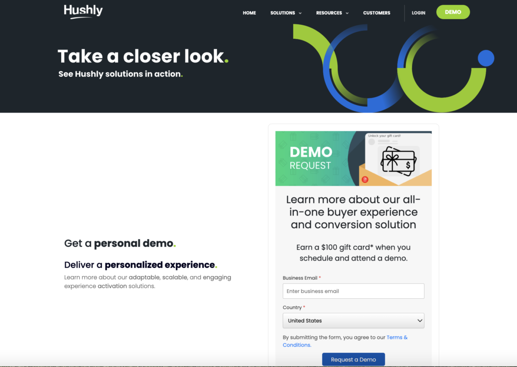
Image from Hushly
2. Nutanix
Nutanix adds a pop of color to their demo request page to fill in the space without adding any distracting elements. The page only includes one picture, which shows a glimpse of what visitors will see in their demo.
Nutanix also minimizes its text. They have one headline and three sentences that encourage visitors to sign up and explain what the visitor is signing up for. Most visitors on this page came here already interested in Nutanix, so additional details aren’t necessary.
The request form has eight fields, including the essential request for a demo email. While this form is longer than the recommended average, it fits the audience. Nutanix markets to enterprises, which are generally larger businesses. The extra fields, like job title and job function, help the marketing team qualify demo leads to avoid focusing too much on irrelevant leads. It also helps marketers customize future interactions.
The purple submit button helps the demo signup stand out so visitors don’t forget to submit the form after filling it out.
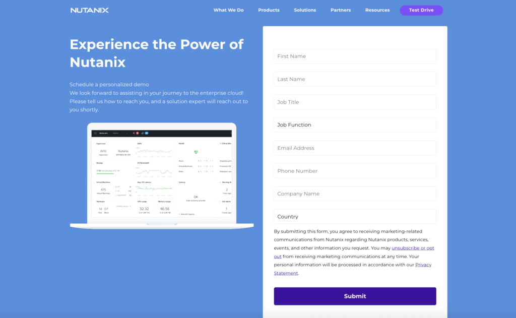
Image from NUTANIX
3. TechTarget
TechTarget’s demo request page looks slightly different from the other two options.
What first stands out is the lack of links. TechTarget streamlines the web page by even removing the navigation bar at the top of the page. They want to ensure anyone visiting the product demo page has only one option: sign up for the demo.
TechTarget has more words on its product demo page than the first two examples. They take extra time to explain the demo, how TechTarget intends to use the visitor’s information, and directions on filling out the form.
TechTarget also uses a longer form with nine fields. The form fields will help TechTarget’s marketing team qualify leads and customize nurturing emails to ensure they address the right audience.
TechTarget takes customization seriously, adding a “Product(s) of Interest” field. This field tells the sales team what products to highlight in the demo and what email offers and information would be most relevant.
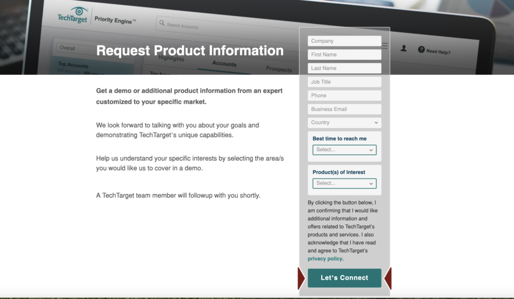
Image from TechTarget
4. NVIDIA
NVIDIA offers a different demo request page experience. Instead of just one product or service, NVIDIA offers over a dozen options.
Despite many available demo downloads, it differentiates each option through colors and images and emphasizes the download buttons.
Each demo has an eye-catching image, a title in a different color, and a short description. Most descriptions only have one or two sentences.
The download buttons are bright green, standing starkly against the black background. NVIDIA doesn’t collect information in exchange for the download.
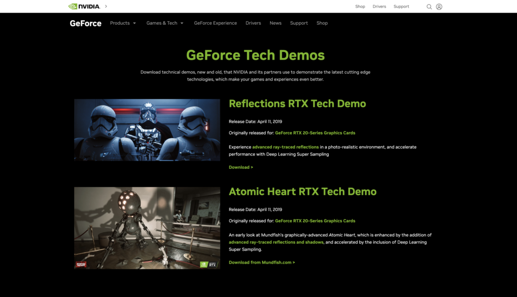
Image from NVIDIA
5. Check Point
Check Point’s demo request page shows another way to showcase multiple demos. While TechTarget asks visitors to choose products from a drop-down menu, Check Point created individual demo signup pages for each product.
Visitors first land in the Product Demo Center. This streamlined page has a one-sentence introduction before listing all four products with a small logo to differentiate them. Then, each product has a quick blurb helping customers choose the most relevant demo. Each blurb begins by highlighting a customer benefit.
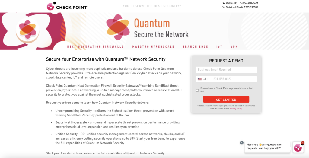
Image from Check Point
Once customers click “request a demo,” they arrive on the individual landing pages. Each landing page no longer has a navigation bar at the top but entirely focuses on the demo to encourage visitors to act. A small form asks for the visitor’s email and phone number, staying within the recommended field number.
Check Point does add several paragraphs for each product so that customers can learn more about the products. The description highlights each product’s primary benefits and ends with a book a demo CTA, encouraging the reader to sign up for a free demo. The extra text works well for Check Point because they have multiple product demos. Therefore, they want to ensure each demo clearly outlines what makes it unique.
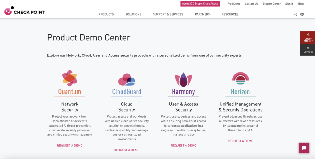
Image from Check Point
6. Snowflake
Snowflake always offers new live demos audiences can join, which is different than most company demo pages. Yet, it’s still very effective because live sessions allow more interaction. Their initial demo page includes a long list of upcoming demos visitors can join. A helpful addition Snowflake includes is search filters. Visitors can narrow demos by region, workload, and industry to help them find the most relevant demos.
The demo page doesn’t include a navigation bar, which minimizes distractions. Most of the page is blue and white, but the “Learn More” buttons for each live demo are bright orange, catching the eye immediately and encouraging visitors to select a demo.
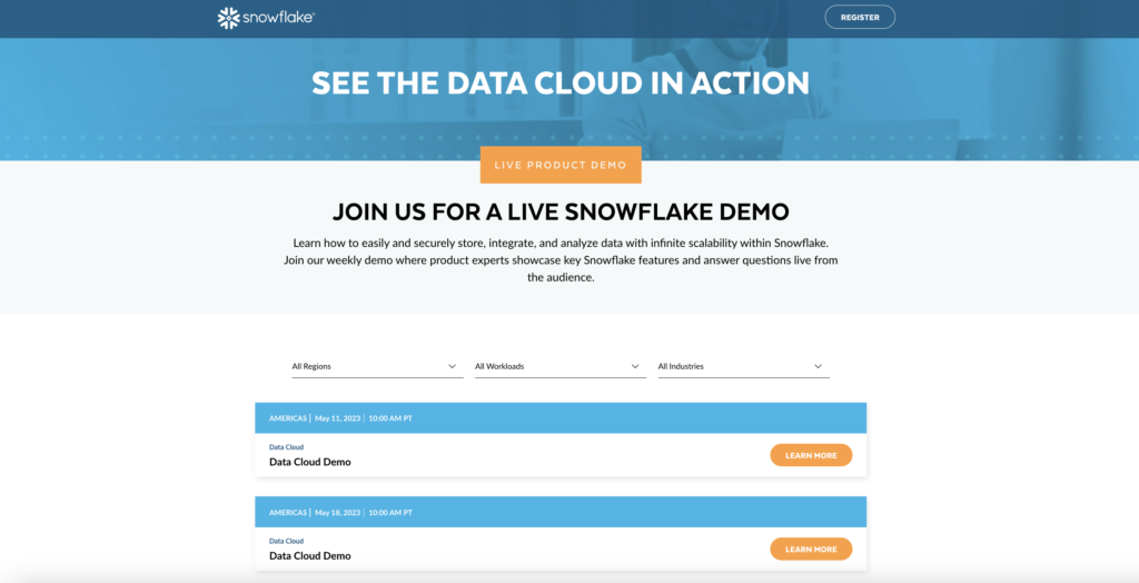
Image from Snowflake
Additionally, each live demo also has an individual landing page. Like the main demo page, the individual demo pages also don’t have a navigation bar. Snowflake does have multiple paragraphs of information which help readers know what makes each demo unique since there are several demo options.
The individual landing pages each have a form of seven fields that capture the lead’s information and provide key details to customize and qualify leads. Just like the main demo page, the signup button is bright orange, which immediately draws the visitor’s eye.
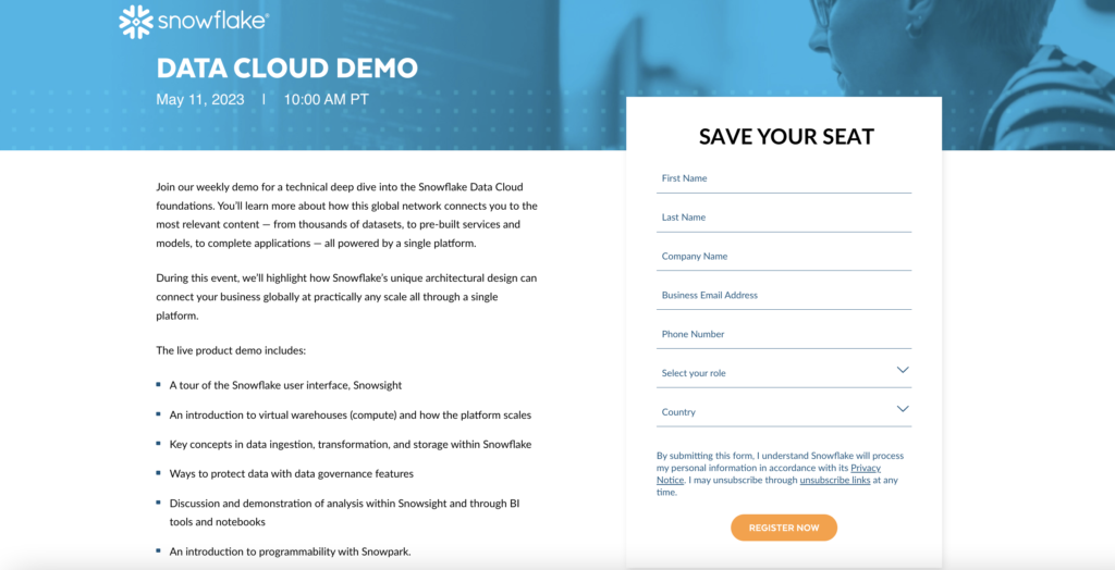
Image from Snowflake
Capture Qualified Leads with Your Demo Pages
Interested buyers are signing up for your demos. Are you capturing their information efficiently enough to nurture and convert those quality leads?
Hushly makes the lead capture process a breeze.
Our sales engagement solutions easily automate the lead capture from your demo forms so you can respond and nurture leads much faster for higher conversion rates.
Ready to get started?
Find out more about our sales engagement solutions, and check out a free demo.